Do Web Forms Get More Conversions Above or Below the Fold?
Marketers are often confused by the question of where to place lead generation forms on landing pages. Are they best placed above or below the fold? Let’s explore the factors that determine ideal placement for maximum conversion rate.
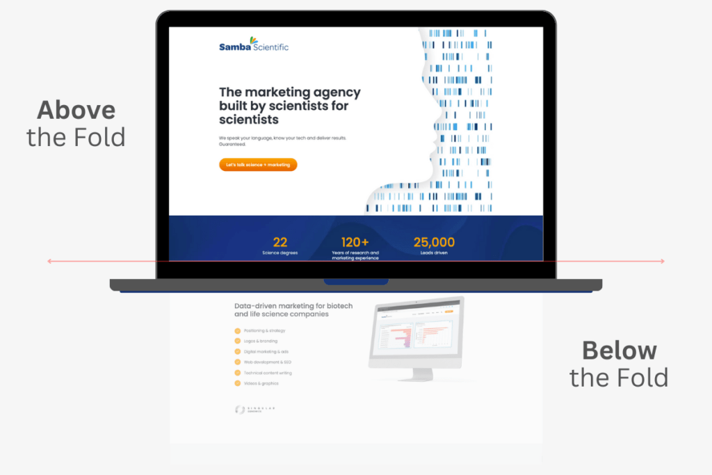
What is the Fold and Why Does it Matter?
The concept of the “fold” comes from print newspapers strategically placing eye-catching headlines and graphics above the folded middle section, where they grab the attention of newsstand browsers. In the digital space, the fold represents the area of a web page that is visible without scrolling down.
Unlike static print folds, website folds vary based on screen size, device, browser dimensions, and other factors. Use your web designer’s preview function or view the page on different devices to get an idea of where the fold may appear for different users.
Common Misconception: Forms Must Live Above the Fold
Above-fold real estate is premium for elements like value propositions and calls-to-action, so many marketers intuitively assume that lead capture forms also belong there. They believe that, if forms live any lower, visitors may exit without scrolling down.
However, placing forms high up often backfires, because it introduces friction before visitors have enough context about your offering. If forms request private data prematurely, exit rates may increase, because consumers don’t like to hand personal details to strangers.
The Truth: Visitors Scroll When Primed by Strong Initial Content
Research shows that most website visitors scroll pages when above-the-fold content provides quality indicators signaling the value of the material. Well-crafted headlines, subheads, introductions, and initial messaging can effectively entice visitors to keep exploring content below the fold. In other words, promising above-fold content convinces visitors it’s worth their time to scroll down.
Purpose and Industry Inform Optimal Web Form Placement
While no universal formula exists, a web form’s purpose and the nature of the industry should inform placement. Certain businesses benefit from trust-building content above forms, while others can position lead capture forms higher.
Webform Guidelines Based on Purpose:
- Expensive Products/Services: Establish value, trustworthiness, and social proof higher on the page before asking visitors to convert.
- Complex Technical Offerings: Place comprehensive functionality explanations, feature details, and configuration specifics above the lead form.
- Long-Term Subscriptions: Outline commitment and contract details before asking visitors to sign up long-term.
- Free Trials/Samples: Position forms higher because there is less friction when no payment is required.

Optimizing Forms for Higher Conversions
- Gated Content: Offer value with lead magnets, such as eBooks, coupons, and discounts in return for contact details.
- Field Choice: Remove unnecessary fields to reduce friction. Only ask for vital data and avoid over-qualifying.
- Placement: Forms should have close proximity to relevant messaging. Align them next to paragraphs conveying the value gained by providing contact information.
- Visual Design: Match brand styling through colors, fonts, and other elements. Ensure mobility responsiveness.
- Copy: Use power words to communicate benefits and underscore the value gained by providing contact information.
The Only Way to Truly Know: Test Extensively
While these guidelines provide a starting point for web form placement, the only definite way to determine optimal positioning is rigorous testing. Use website platforms with easy editing and built-in split testing, and experiment by shifting forms above and below the fold. Stay nimble, keep learning, and optimize based on data.
If you’d like to discuss landing page optimization, let’s chat! We love to talk marketing!