Highlights
- Complex, cluttered websites overload users and fail to communicate key messages effectively.
- By embracing simplicity in design, user cognitive load is reduced and attention-focused.
- Consistency and visual hierarchy further streamline user experience. Testing and attention to metrics promote continuous improvement.
- Applying these principles to your biotech website optimizes engagement and goal conversion.
Creating an effective biotech website that connects with users and accomplishes business goals requires more than just technical skills. Thoughtful design choices are needed for a site that’s aesthetically pleasing, functional, and targeted at the right audience. By focusing on simplicity, consistency, visual hierarchy, and usability, web designers can create a website that provides a better user experience.
Embrace Simplicity for Your Biotech Website
Simplicity should be a cornerstone of quality web design. Cluttered, complex sites fail to communicate effectively or engage users. By embracing minimalism in layout and content, designers reduce cognitive load. Visitors can therefore focus on key messages without distraction.
Benefits of simplicity include:
- Increased usability and intuitive navigation
- Faster page load times
- Improved mobile experience
- Timeless appeal for a longer lifespan
- Easier long-term maintenance
Eliminating convoluted menus, excessive imagery, unneeded multimedia, and other non-essential elements streamlines the user experience.
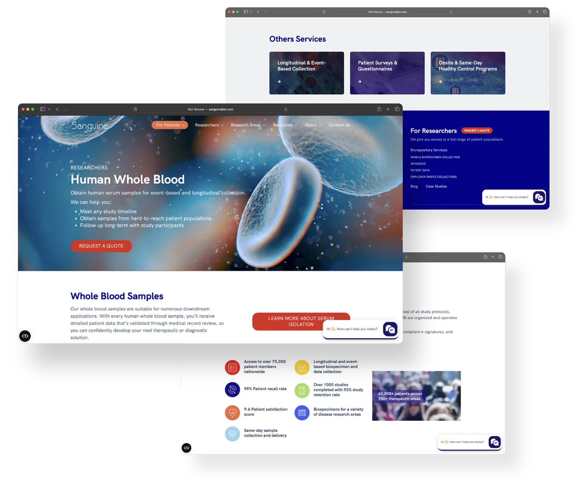
Build Consistent Experiences
Sudden shifts in colors, fonts, styles, or page layouts can disorient users, whereas cohesive experiences support memorability and brand reinforcement. Reusing interface patterns also streamlines production.
Some ways to cultivate consistency include:
- Cohesive visual styling and typography
- Predictable navigation placement
- Uniform user-interface behavior
- Aligned imagery styles and filters
- Consistent call-to-action sizing and placement
Thoughtful consistency creates pattern recognition and aids learnability for return visitors. It immerses users in branded aesthetics. Development reuse also minimizes bugs.
Direct User Attention with Hierarchy
Establishing a clear visual hierarchy guides users’ attention, minimizing the cognitive load required to parse page content. Leveraging size, color, position, negative space, typography, and imagery to distinguish primary and secondary content improves scannability. Effective hierarchy focuses users on calls to action.
Some hierarchy establishment techniques:
- Varying font sizes and contrasting weights
- Using negative space and whitespace
- Strategic color contrasts
- Positioning important elements in sightlines
- Using supportive imagery and icons
Well-executed hierarchy along these lines enhances user comprehension of key messages.
Prioritize Usability and Functionality
Website functionality and usability determine how easily visitors can use pages and features. Key indicators like efficiency, error prevention, navigation, loading speeds, and satisfaction require coordination across design and development. Inputs should be simple and flow intuitively.
To determine benchmarks:
- Measure task efficiency with user testing
- Optimize loading speeds with the help of performance analyzers
- Assess satisfaction through surveys and analytics review
By outlining requirements early and maintaining alignment between design and development, you can achieve optimal usability and functionality.
Conclusion
By committing to core design principles as the foundation, websites engage audiences and fulfill goals. Even with evolving technologies, the application of these concepts can consistently create cohesive user experiences. A simple, consistent, hierarchical interface backed by analytically-verified usability, forms the basis for converting visitors into customers. Flashy add-ons cannot compensate for lapses in these areas.
Get our full eBook on improving biotech website design here.
