There’s a particular kind of pressure that comes with a product launch at a major conference.
You’re not just showing up. You’re unveiling.
Your booth or suite isn’t just a spot on the conference exhibit map; it’s a first impression, a proof of concept, and a company manifesto all at once. Every design element, tagline, T-shirt, and video frame is telling a story about who you are and what you believe is possible.
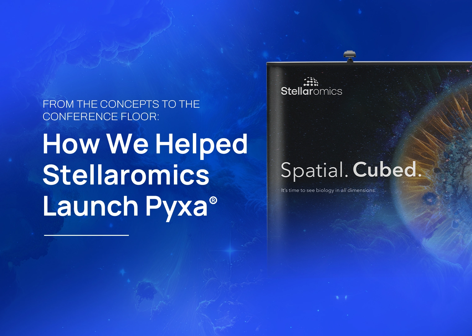
When Stellaromics came to us ahead of AGBT, that’s exactly where they were. A new spatial biology company with a genuinely exciting instrument, Pyxa®.They had a full reveal ahead of them: announcing their presence in the multi-omics space with a new website boosted by a plan to launch into the spotlight at a major industry event. Everything, all at once, and the landing had to be flawless.
This is the kind of project we live for.
Starting With a Feeling
Good branding often starts before anyone touches a logo file. It starts with mood boards, scattered references, and a lot of “what if we…”
For Stellaromics, two creative territories emerged early: space and ocean. Both made intuitive sense for a company working at the edge of what’s visible in biology, pushing into dimensions that were previously out of reach. Both carried a sense of depth, discovery, and the vastness of the unknown.
But mood boards aren’t decisions. They’re invitations.
Our skilled designers put a lot in front of the Stellaromics team, including Behance boards, bold color palettes, conceptual directions, and visual metaphors, and we watched what resonated. What came back wasn’t one direction or the other. It was a combination: the abstract light and color of space, filtered through the idea of dimensional depth. The feeling of seeing something previously inaccessible and revealing a more complete story rather than slices.
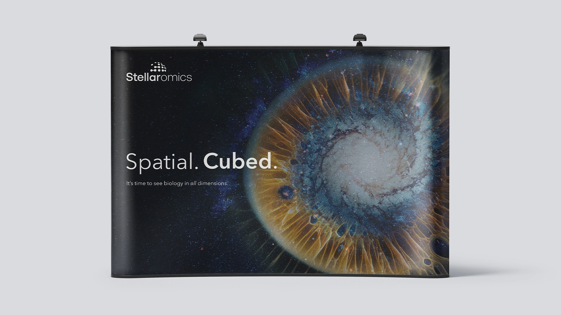
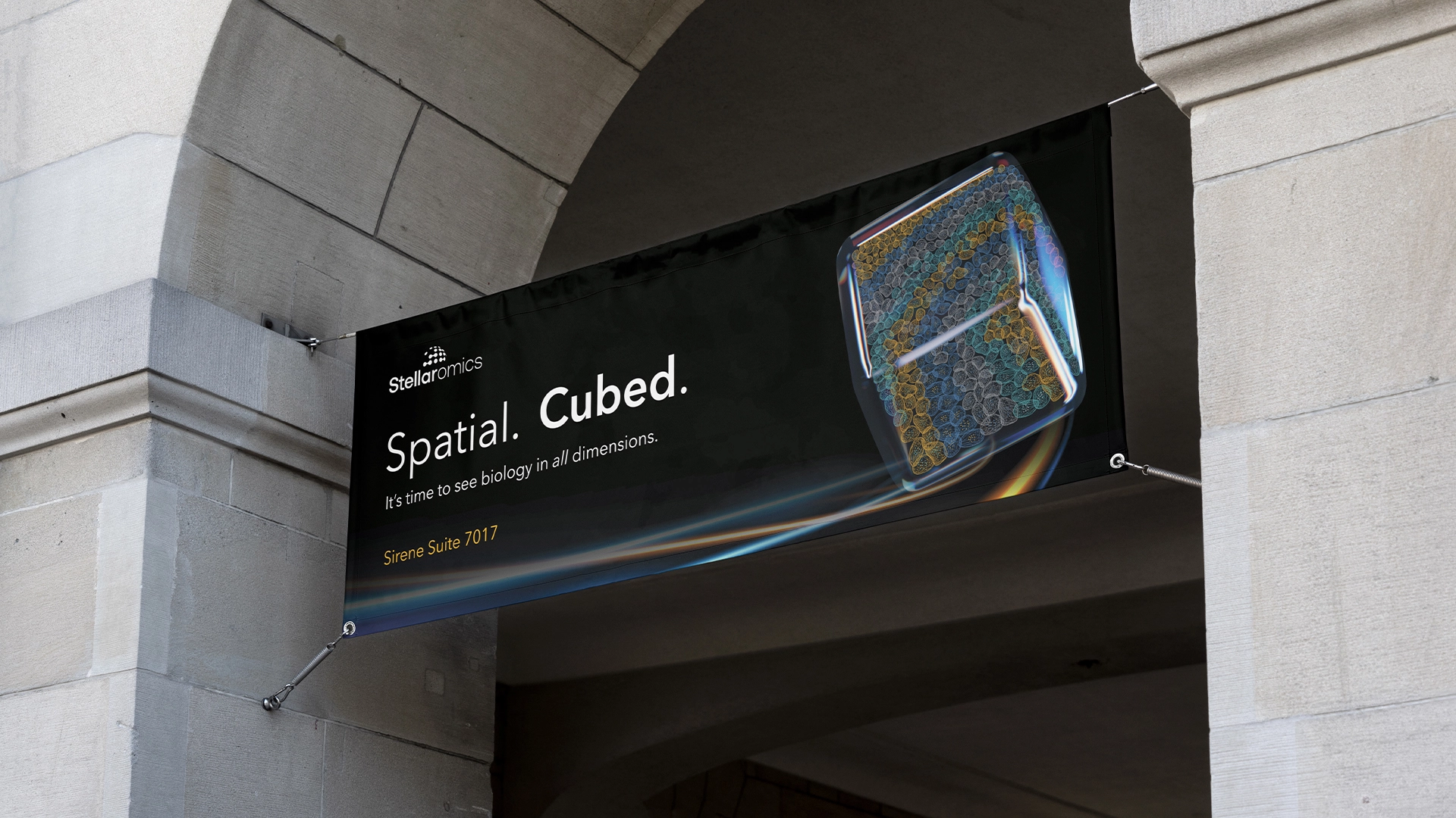
That synthesis became the creative foundation, which we called the “Space Iris.” It was abstract, luminous, and layered. The theme showcased light bending through a breathtaking cosmic lens, eliciting a sense of wonder and endless potential for discovery.
Walking a Fine Line (Without Falling Off)
Here’s the tension that lives at the center of this kind of work: the concept must be compelling without being confusing.
“Inspired by the vastness of space” is a short walk from “we literally think we’re NASA,” and that’s not a useful destination for a spatial biology company launching a sequencing platform. We needed the visual language of discovery and depth without tipping into science fiction or cheesy galaxy imagery, especially when working with a company name that starts with “Stellar.”
The solution was restraint and thoughtful reconstruction of themes. Space-inspired color gradients were paired with a three-dimensional cube motif — clean, structured, scientific. Then, we pulled in a single accent color: yellow. Warm, grounding, distinct. Something that didn’t look like every other dark blue biotech brand and that would stand out on the conference floor.
Taglines got the same treatment. We explored a lot of them. (Really, a lot.) The goal was something that wasn’t too cliché, something fun without being flippant, something simple enough to live on a sticker and meaningful enough to hold up on a website. We wanted something that would make you think about new possibilities while remaining grounded in the solid science that was at the core of the innovation.
With half a dozen creative scientists in a Zoom call, ideas are endless. The wrangling is the actual work. Client preferences, visual clarity, scientific credibility, and a memorable personality all need to work together to build a strong brand.
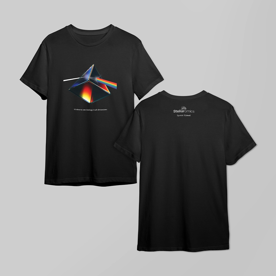
Swag That Actually Makes People Stop
One of the most honest tests of a brand is what happens when you put it on a T-shirt.
If the design requires explanation, you’ve lost. If it looks like everything else, you’ve also lost. The goal is something a scientist actually wants to wear; something clever, creative, and not just a giant logo.
For Stellaromics, we leaned into the 3D motif in a way that rewarded the people who’d get it: a Pink Floyd Dark Side of the Moon riff, with the iconic triangle rotated and reimagined into a true prism inspired by the Pyxa cube. It was a pop culture tie, parallelling the mysterious parts of space that we can’t see to the components of tissue samples that were previously unexplored.
And it landed.
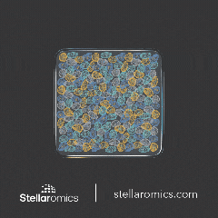
The lenticular sticker we designed was another winner, the kind of swag that makes someone pick it up and say, “Wait, how does this work?” That moment of interaction is exactly the point. It mirrors what Stellaromics is actually doing: revealing more than standard methods in spatial biology.
Swag done right isn’t merchandise. It’s a conversation starter and a brand impression.
The Conference Presence
Conference presence means more than having a booth. It means the whole physical experience of encountering a brand in a noisy, crowded space where everyone is competing for the same attention.
The Stellaromics presence at AGBT included a full suite with a large backdrop, pop-ups, tablecloths, and a cling above the escalator that invited attendees to see what they had to offer. All assets utilized the same Space Iris visual identity and taglines that emphasized how they were reimagining spatial biology and opening new possibilities by going from 2D to 3D. The goal was consistency. Someone seeing the cling while going down the escalator, then past a pop-up in the hallway, then walking into the suite to learn more should feel like they’re on a clear path to discovery.
The Video: People, Machine, and the Meaning Behind Both
Printed materials get you seen. Videos allow you to be felt.
The live action video that we produced for Stellaromics wasn’t a product demo. It wasn’t a spec sheet with motion graphics. It was a live-action story that included the people behind Pyxa, the instrument itself, and the program imagery that shows what the technology actually reveals.
The goal was to answer the question every new company is faced with: Who are you, and why does this matter?
That’s a harder question than it sounds. It requires showing real faces, real conviction, real science — and doing it in a way that doesn’t feel like a corporate video from 2009. The Pyxa machine had to look like the precision instrument it is. The team had to feel like scientists who built something they believe in. The imagery and storytelling had to make you feel what it means to see more dimensions than you could before.
We’re proud of how it came together.
What Actually Makes This Work
As AI becomes more and more prominent in marketing, there’s a conversation worth having about why this kind of creative work is hard to replicate with AI tools alone.
Not because AI can’t make things that look interesting (we know it can), but because the true thing that made this project work came down to chemistry: the chemistry between design and marketing elements paired with the innate understanding of the literal chemistry that powers Pyxa, which is still an area where AI falls behind.
The Space Iris concept didn’t come from one person having one idea. It came from a team of scientists and designers iterating together, reading client feedback accurately, knowing when something was “close, but wrong,” and understanding the difference between what looks like science and what is science. A scientist on our team would catch something in the workflow infographic that a pure design eye might miss. A designer would see what the scientist was describing in a way that could be communicated visually.
That back-and-forth, the workflow between subject matter experts, is the key. AI is structured and recognizable in how it operates. It doesn’t have that human creative metabolism: the unexpected leap, the instinct that something’s off, the willingness to throw out a near-miss and start again because the fit isn’t right yet rather than regurgitating something that’s still incorrect but in a different way.
The other thing that made this work was the underlying project management that held it all together. Creative work at the pace of a conference deadline, with multiple deliverables across print, digital, and video, requires logistics and coordination that’s invisible when it goes well. (Spoiler: it went well!)
The Launch
Stellaromics walked into AGBT with a complete brand presence: a name people hadn’t heard, an instrument they hadn’t seen, and a visual identity that told the right story before anyone said a word.
The website launched and welcomed traffic from a press release. The conference suite was full of curious scientists. The stickers and t-shirts disappeared.
That’s a launch.
We’re glad we got to be part of it — and glad that the science behind Pyxa is as compelling as the work that we got to do when telling that story.
Interested in building a brand presence for your next product launch or conference? We’d love to hear what you’re working on. Let’s connect.